
Over the last 4 years I have gained a lot of insight into making content that is clearly accessible to the visually impaired.
When I started working with several organisations including Brightlife, Age Friendly Cheshire, Social Butterflies and Age-UK Cheshire on their marketing and information booklets. It became part of my job to ensure their clients were able to access the content I created.
Their clients were people over 55 and older people are far more likely to have a deterioration in their eyesight. It was vital to ensure that the content came within certain perameters. Of course these organisations had guidelines but I also did a lot of research into this myself.
However, it’s not just older people who might struggle to access visual content. Many people are born with impaired or restricted vision or suffer vision loss through accidents or illness at any age.
There are many other aspects that can affect someones ability to access visuals whether that’s dementia, dyslexia or colour blindness. I came to understand that it’s not for use to decide whether someone might want to access our content or not. We should try to make that as easy as possible for them.
There are a few really simple tips you can use to help your content be more easily readable, that will benefit everyone!
MAKING FONTS ACCESSIBLE
Font selection obviously plays a huge role in making your content accessible to the visually impaired.
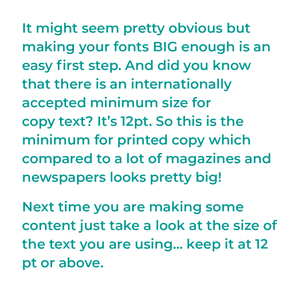
1. ADEQUATE SIZE
It might seem pretty obvious but making your fonts BIG enough is an easy first step. And did you know that there is an internationally accepted minimum size for copy text? It’s 12pt. So this is the minimum for printed copy which compared to a lot of magazines and newspapers looks pretty big!
Next time you are making some content just take a look at the size of the text you are using… Keep it at 12 pt or above.
2. THE RIGHT FONT STYLE
Another important factor is font style. It’s easy to be seduced by a fancy font but these can be a nightmare for readability.
The trend for script or hand written fonts has been huge recently but it’s better left for very large titles or decorative words. For important information and large areas of text, stick to a simple serif or sans serif font.
MAKING COLOURS ACCESSIBLE
There are some simple factors to consider to make sure your use of colours is accessible to the visually impaired.
3. ENSURE THERE IS ENOUGH CONTRAST
You may have worked really hard on your brand colours, or be working with already established brand guidelines but being mindful or layering of how you use this colours together can make a big difference to accessibility. Avoid layering similar colours on text and ensure they have enough contrast.
I am currently having to review my own colour palette because of this… which just shows we all have to work at it! It’s not about getting it completely right at all times… but making small moves towards accessibility.
I am using this handy chrome extension called Colour Contrast that not only shows you the hex codes of colours from any webpage (great of you are researching your colour palette!) It allows you compare colours against each other and adjust to test for contrast visibility.
Why not give your own website or social media page a try?
4. AVOID WHITE ON A DARK GROUNDS
White text on a dark or black ground can be much harder to read even in an accessible font and with enough contrast so avoid this for large blocks of text. It is for this reason I am not at all keen on black/dark ground websites! They are much harder on the eyes.
It is fine for titles especially for those that you want to draw attention to or social graphics with few words. Ensure you use heavier weight fonts (semi-bold/bold/heavy) and a much larger pt size.
5. AVOID LAYERING COMPLEMENTARY COLOURS
Layering complementary colours like yellow/purple, orange/blue and especially red/green should be avoided. It can make things really difficult for anyone who it colour blind. It also affects contrast as above so can make it difficult to make out the letters…. see below.

SURPRISING FACTS ABOUT LAYOUTS
There are a few things to consider about layouts that you might not have thought of….
6. LEFT JUSTIFIED IS BETTER FOR EVERYONE
Less obvious and a mistake I have made with my own social media graphics in the past is centre justification. It might look ‘neater’ or more well designed but it can really degrade readability, especially for dyslexics and anyone with dementia. It makes it much harder to jump to the next line which can interrupt and confuse the reader..
Left justification (in the west) should be used as much as possible especially for large blocks of content. The odd social media tile of a few words that’s centre (or right) justified is not such a big deal though!
7. AVOID OVERLAPPING TEXT/IMAGERY
Overlapping text over imagery or background details can be really disruptive for the visually impaired and also for people with certain learning challenges such as ASD or ADHD. They can find it hard to distinguish the characters from the details so that is best avoided. Use design details and imagery to reinforce your message not interfere with it! And remember less is more.
WHAT ELSE YOU CAN DO…
8. USE ALT TEXT
An area that began with web-design and has now made its way into social media: this is text that you use to describe an images content and purpose. It is intended for screen readers that read content out loud to people who can’t otherwise see it.
It’s advisable to do this for all your key website imagery and I must admit it’s something that come onto my radar recently so this site itself is not complete. I am now adding as I go but there’s a huge back log of images that need alt-text adding and I wish I had done it from the start.
Many people are also adding them to the bottom of their social media captions too. It’s something I definitely feel I need to pay more attention to myself!
You can read more about alt-text and how to add it to your content in this Microsoft Support Article.
JUST DO YOUR BEST…
So that is my round up of easy ways to make your content more accessible to the visually impaired. It might feel a bit overwhelming but you don’t have to completely overhaul your branding right this minute, especially if it means changing an established colour palette.
You can make some small changes or just pick one such as starting to add alt-text to your posts or website. Even just being aware of these tweaks to your content can make a big difference to your audience.
Thank you, great points raised and I lots to think about before publishing any content
Glad it helped! I think it’s important to stress that it doesn’t have to be perfect but any move towards more accessibility is a good thing!
Really interesting. I had no idea about layering colours or left justified text. I will look at my own content and branding in a new light now.
Its just something to bear in mind! As I said the odd social tile isn’t a big deal, but for large blocks of copy on websites or in leaflets etc then best avoided.