
Have you ever fallen out of love with your brand colours? How do you know if you should change them or not?
Let’s explore when, why and how to update your brand colours when they are no longer serving your needs.
Having a consistent colour palette is one of the fastest and easiest ways you can create a strong brand identity.
It’s usually the very first thing I work with client to create, even before we start looking at fonts, logos or any other components of a brand identity.
With only 3 seconds to make a good impression, use of colour is the fastest way to grab attention, evoke a feeling and attract people to you.
But before we go into the why and how of changing your colours, first let’s explore…
When NOT to change your brand colour palette
There are a few reasons why you might feel you want to update your colours when you really shouldn’t!
- You’re bored. You’ve been using your colours for a while, maybe years. You are a bit sick of them and fancy a change.
BUT if your palette was well thought out to start with PLEASE resist the urge to change for the sake of it. Remember your ideal client doesn’t see your stuff anywhere near as often as you do. - You’ve seen someones else’s you like better. This is a tricky one. It’s great to take inspiration from elsewhere and be aware of what other people in your industry are doing.
BUT you need to remember they aren’t you. Their clients are not your clients. Beware of comparisonitis! Try not to be influenced by people you perceive to be doing it “better’ than you. Stay on your own train. - Rebranding for attention. So this is a bit of a contentious one! I don’t know how often this happens but I know it does. A “rebrand” ie: change of colour/fonts/logo can be a GREAT talking point on social media and marketing.
BUT unless you are actually changing your services, product or ideal client then in my opinion it’s unnecessary fluff. Concentrate on making sure your products or service actually help your ideal client and talk about that. That will be a far better use of your time and effort.
Not staying consistent and changing your colours too often can create an aura of uncertainty and make you less recognisable/visible out there. So where possible, keep a consistent brand image and resist the temptation to change for changes sake.
Having said all that, there are some really genuine reasons you might want to relook at your brand colours.


5 problems you may have with your brand colours…
1. You have too FEW.
Lots of people start off in business with a small budget. You might have paid for a basic logo to be designed or created one yourself. You may not have thought too deeply about supporting colours for your brand at the time.
So you are stuck with a couple of colours that match your logo and you get frustrated when creating graphics. You find it hard to make things stand out, particularly when you want to draw attention to a call to action or sales post.
This can often lead to…
2. You have too MANY.
So then you find you need some more colours for a particular post or info graphic. You pull some “nice” but random ones from something you have seen on Pinterest. Or find colours that are already loaded into a Canva template that vaguely work with your brand colours so start using those too.
But because there has been no thought behind this, no plan, you end up with graphics that don’t work well together and a palette that is bloated and confusing.
Now you are confused about what colours you should be using and when! It needs rationalising and bring back inline with your brand vision.
3. You haven’t checked they are accessible.
Confession time. This is EXACTLY why I tweaked my colour palette last year. Despite YEARS of working with charities aimed at people with accessibility issues I hadn’t checked my own brand colours. It had been on my mind to do it for ages
It’s so common for small business to not even be aware of these issues, and that’s OK. You might even feel this isn’t something that needs to be on your radar right now.
But personally I feel that we should make an effort to ensure that our content is as accessible to as many people as possible. You never know who might be watching your stuff.
Especially when it can take just a few minutes to ensure we are using our colours in an accessible way. I recommend some tools below but if you would like to learn more about this then do give me a shout.
4. They are no longer relevant.
When you have been in business a while, you might out grow your colour palette. Most colours are transferrable but sometimes they just might not fit with your new direction or client base.
For example one of the clients I am working with at the moment has a child oriented business. Her original logo and colour palette were very bright and now look a little harsh/simplistic. Her work has evolved to be aimed more at parents and teenagers so while wanting it stick with eye catching colours, they now need to be more sophisticated. So we are working together to create a new direction for her brand
5. You have a new project or product.
How exciting! You have a brand new project, course or product that is targeted at a completely different audience to your current brand. So your existing colour palette either doesn’t fit or you need to find ways of amending it/adding to it to create that distinction from your other work.
6 Tools you can choose to create or update your colour palette
Once you have decided that you are updating you colours for the RIGHT reasons here are some of the tips and online tools to help you go about it…
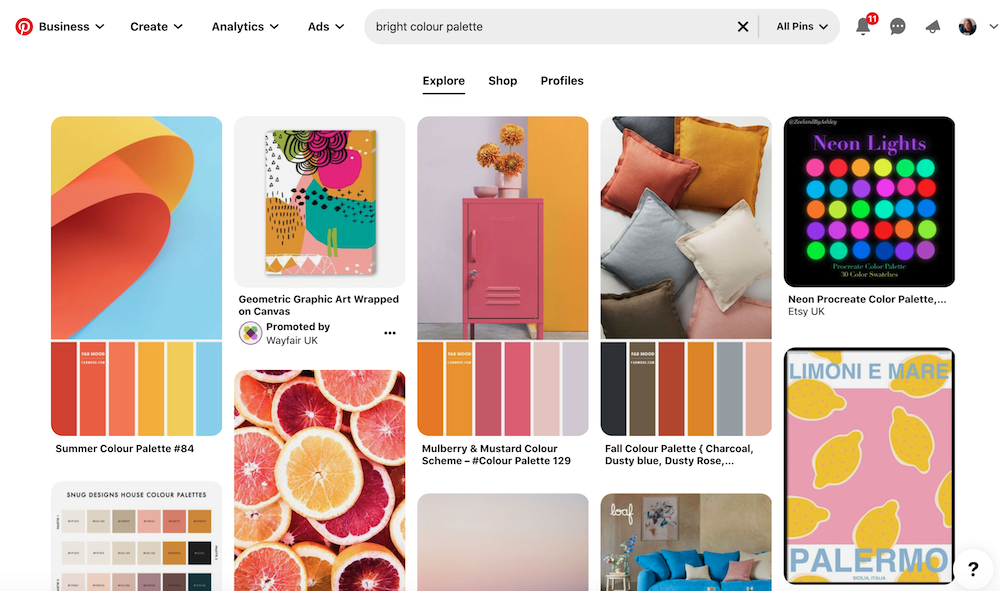
- For research and inspiration head to Pinterest and search for palettes around your central colour themes. Search for key words that are relevant to your brand or ideal client.
- For a quick guide to how you can use colour to evoke a certain response or feeling, you can read my previous blog post on Colour Psychology
- For a really cool way of finding new colours, organising and refining them, head to Coolors.co. You can also download your palette into an image with the Hex codes for easy reference.
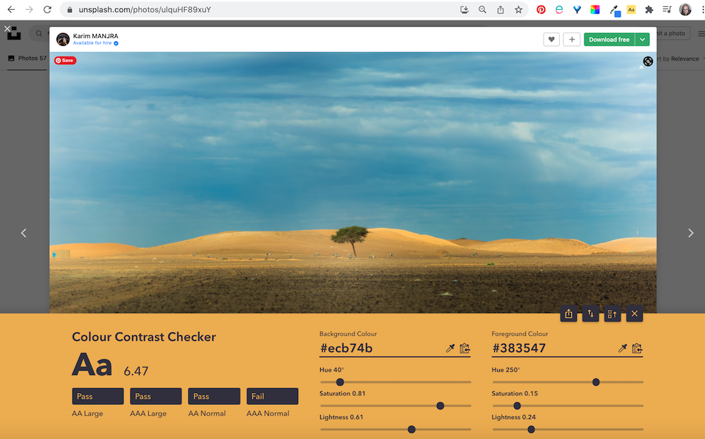
- Find an inspirational image and use a colour picker to select colours from them. Search for key words in free image sites like Unsplash, Pexels and Pixabay
- Check your colours against each other for accessibility and contrast with the Colour Contrast Checker chrome extension or website.
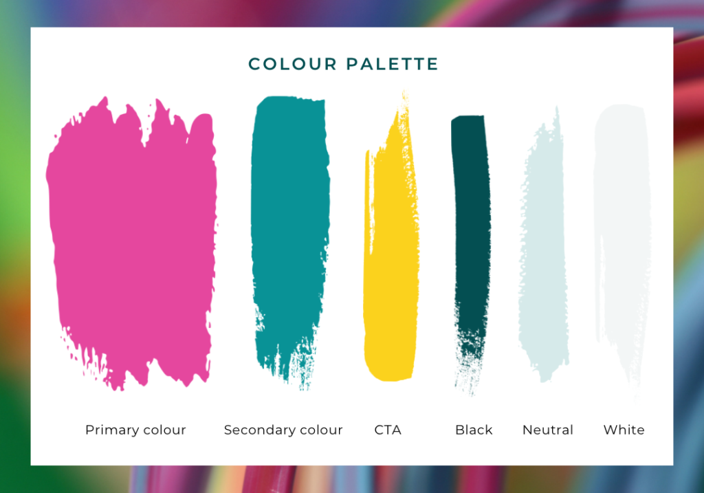
- Once you have your colour palette sorted, you can use one of a huge range of Canva templates to create a document you can refer to again and again.
What should your colour palette include?
There is no a hard and fast rule but in general you will need:
- One or Two brand colours: Strong colour/s you can use consistently so they become integrally associated with your brand. If you already have a logo then this is a good starting point!
- A ‘POP’ colour: A bright or engaging colour used to draw the eye to important elements or call to actions. (Especially important for buttons on Websites!) In the right context a pastel can work here too.
- A dark colour for text (Black/grey/navy/brown): Sounds obvious, but if an alternative to black would appeal to your ideal customer then you need to make sure it’s selected and used consistently.
- A pale neutral or pastel colour to highlight headers/backgrounds/box outs. This is often the colour that people overlook and then start using something random when they find they suddenly need it. This leads to muddied waters!
- A ground colour: In most cases this is true white but could be a very pale cream, grey or even a pastel.
Remember rules are made to be broken but any more colours than this may confuse your brand image. You will need to put some rules in place around how additional colours are used.
Fall back in love with your brand colours!
Hopefully this post will have gained you some clarity on when to update your colours and when NOT to! And also given you some tools and guidance to help you create a palette you love and more importantly is relevant and attractive to your ideal customer.
If you would like to read a little bit more about how to combine your colours with fonts, images and your logo to create a complete brand identity then head to my Brand Guidelines post from 2021.
Would you like some professional help with your brand colours? Feel free to drop me an email.