Choosing a colour palette for your brand is more complicated that just picking colours you like! I have collated this super simple visual guide to Colour Psychology to help you make your brand stand out from the crowd.
Research into consumer behaviour suggest that they: “make a subconscious judgment about a person, environment, or product within 90 seconds of initial viewing and that between 62% and 90% of that assessment is based on colour alone.” (Source: ColorCom Why Color Matters)
While obviously you have to like your own colours it more important that they appeal to your ideal customer. Understanding and using colour psychology, and the emotions colours evoke, can be a really powerful way to make your brand stand out and appeal to the people you want to work with.
RED IS THE COLOUR OF ACTION!
+ Exciting, passionate, daring
– dangerous, risky, warning
Red makes us take action!
Sectors: entertainment, travel, protection
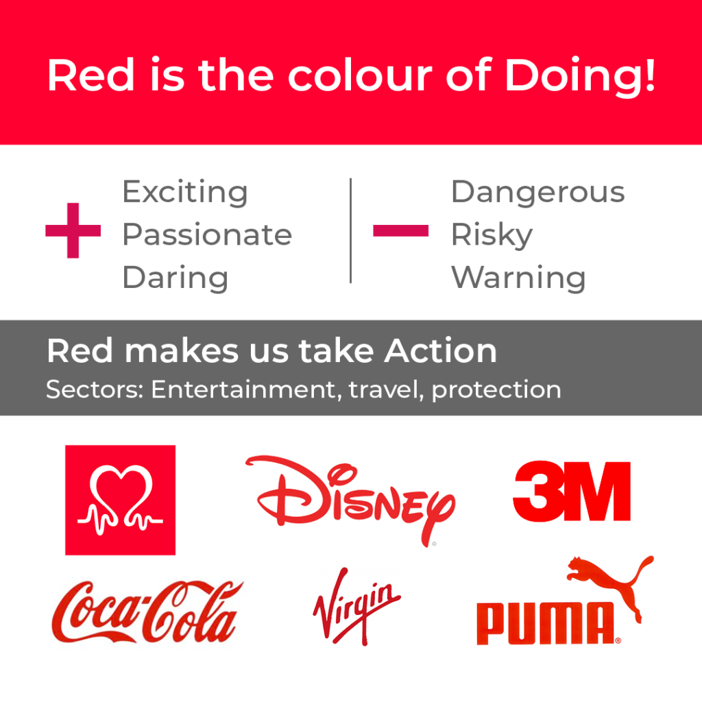
BLUE IS THE COLOUR OF SECURITY
+ Strong, reliable, calm
– Cold, distant, authoritarian
Blue makes us feel trust.
Sectors: Health, finance, security, technology
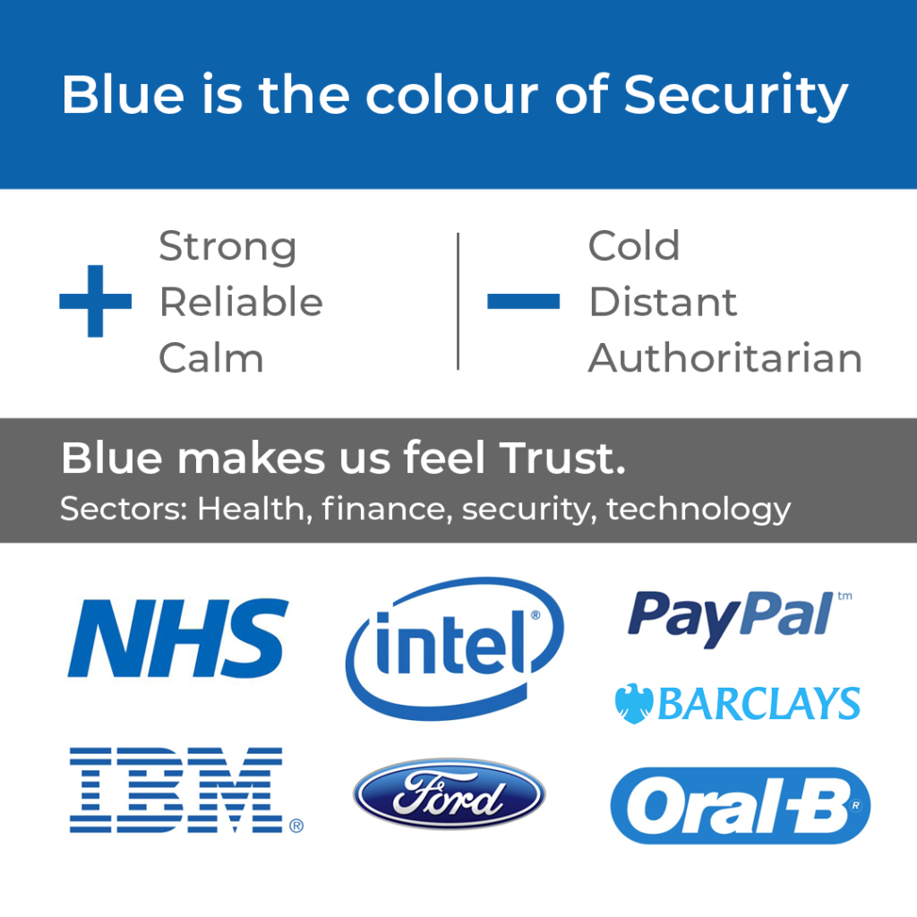
GREEN IS THE COLOUR OF HEALTH
+ Healthy, ethical, tranquil
– Envy, boredom, bland
Green connects us to nature.
Sectors: Health, environmental, well-being
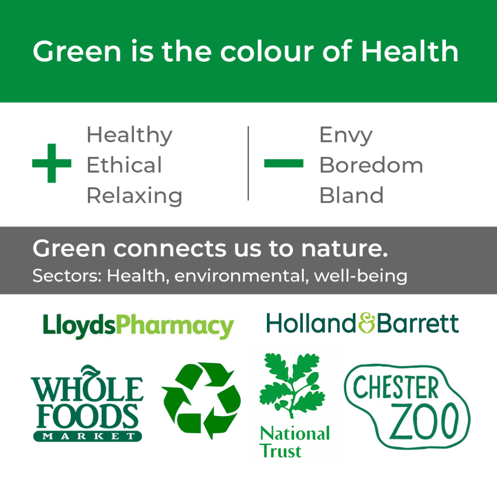
PURPLE IS THE COLOUR OF LUXURY
+ Spiritual, royalty, enlightened
– Decadent, moody, aloof
Purple encourages self-awareness
Sectors: Mindfulness, coaching, luxury goods
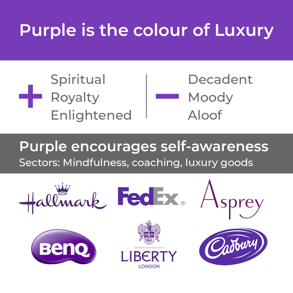
ORANGE IS THE COLOUR OF FREEDOM
+ Fun, optimism, vitality
– Immature, frustrating, frivolous
Orange makes us feel adventurous
Sectors: Art, transport, food, communication

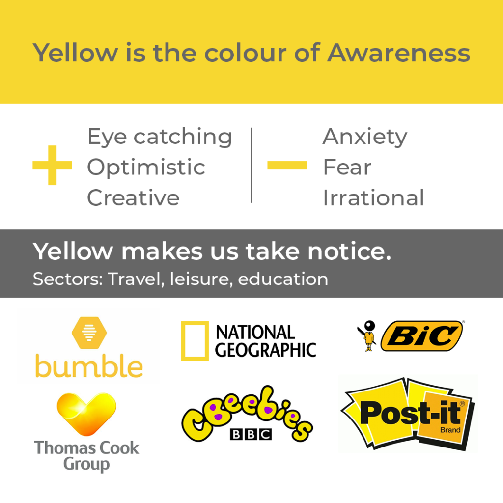
YELLOW IS THE COLOUR OF AWARENESS
+ Eye catching, optimistic, creative
– Anxiety, fear, irrational
Yellow makes us take notice.
Sectors: Travel, leisure, education
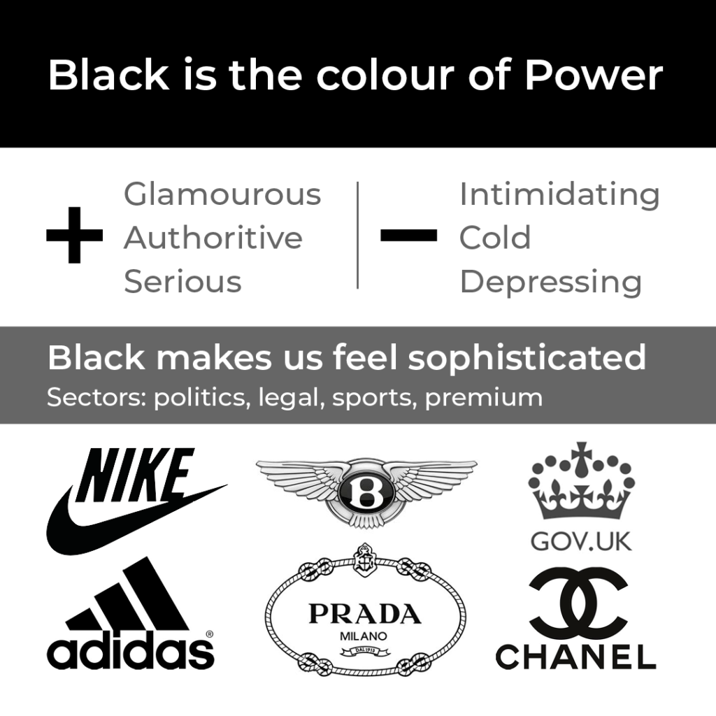
BLACK IS THE COLOUR OF POWER
+ Glamourous, authority, serious
– Intimidating, cold, depressing
Black makes us feel sophisticated
Sectors: Politics, legal, sports, premium
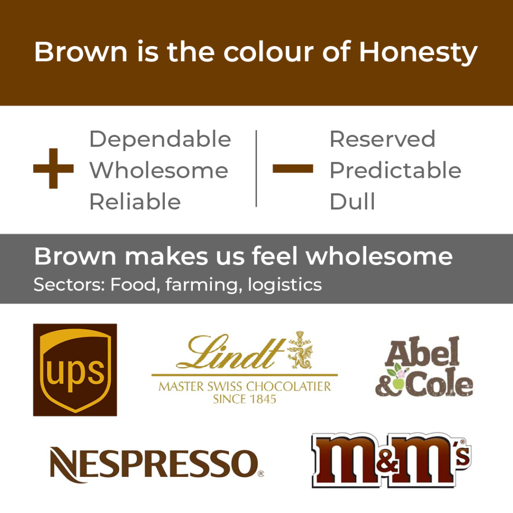
BROWN IS THE COLOUR OF HONESTY
+ Dependable, wholesome, reliable
– Reserved, predictable, dull
Brown makes us feel wholesome
Sectors: food, farming, logistics
Now make your Brand Stand Out
You can use Colour Psychology to:
- Evoke a certain mood
- Get your Brand noticed
- Create an instant impression
- Appeal to your ideal client
- Align yourself with you sector
- Stand out from the crowd
And you can see in many of the examples above is also possible to combine two or more colours to convey a more nuanced message.
I hope this guide is useful to you and if so I’d love to hear from you! And if you need any help creating a palette that will make your brand stand out then feel free to say hello


Ooh loved this explanation, I def don’t think about colour enough, thank you for the inspiration
Having decided on my brand colours based on colours that I love, this is very interesting!!
Often as a creative, you will be drawn to colours that already align with what you want to say… it’s not as if you *CANT* use a colour you want to just because of the psychology… It’s just good to be aware of what it might evoke in people.
What a brilliantly simple guide. Helps you to make those colour choices more conscious. Thanks
Great, easy-to-read explanation on colour. Thank you for sharing.
Such a super simple and easy way to explain it – thank you! Interestingly I settled on purple randomly as my logo is a rainbow but this description is so accurate!
What about pink tho?
Pink and Teal/turquoise are coming! But I ran out of steam last night so I will add those at a later date…
Pink (magenta) embodies compassion, empathy and creativity! (negatives: over emotional and a bit impractical!)
This is a fab blog! I chose my colours and then went on to read about them before implementing them. I think it took me 3 times to get it right for my website. This would have helped then! It’s so clear and well written 💗