A logo is an important part of your brand, but a logo on its own isn’t enough to create a fully functioning visual identity.
You also need a usable colour palette, a clear font hierarchy, supporting graphic assets, a consistent photography style, logo variations and some guidance around how all of those things work together.
That might sound like a lot, but it doesn’t need to be complicated, difficult or expensive. It DOES need to be done with intention.
Because underneath the request for “a new logo” is usually the desire for something much bigger: a brand that has all the tools you need, makes it easy to create content and makes you proud to put your business out there.
A logo simply can’t do all of that on its own.
Your colour palette needs to work in real life
One of the things I often see is a very limited colour palette, maybe two or three colours that appear in the logo.
That might be enough for the logo itself, but what happens when you need to create a website, presentation, PDF or a month’s worth of social media content?
Suddenly those two colours have to work VERY hard.
At a minimum, I think a useful brand palette needs:
- 1–2 strong brand colours
- a ‘white’, which might be true white or an off-white
- a ‘black’ for text, which doesn’t necessarily need to be black
- 1–2 supporting neutral or pastel colours for backgrounds and other elements
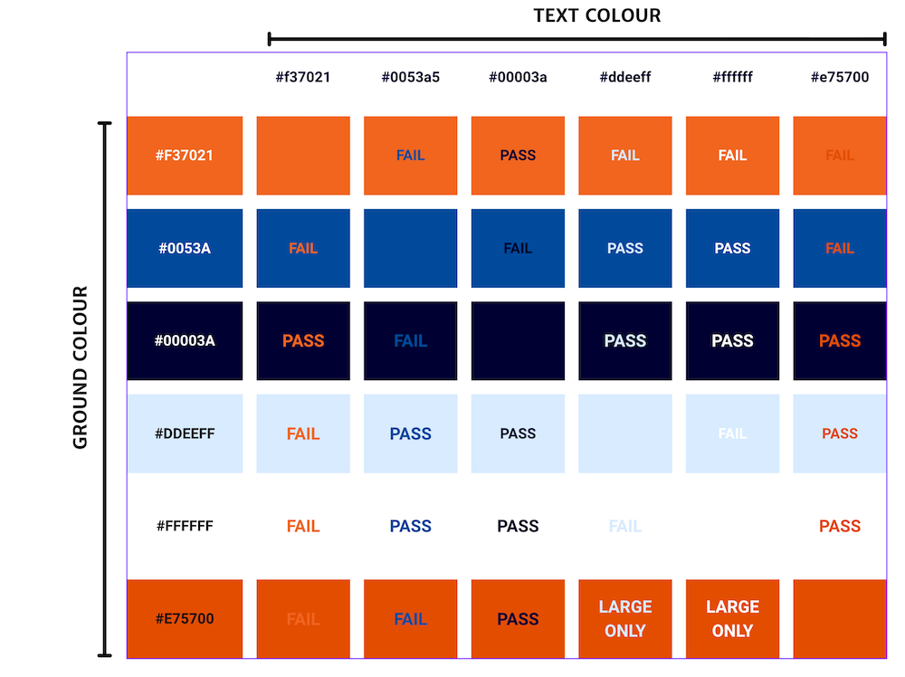
I recently started a rebrand for a charity that wanted to keep its existing bright orange and royal blue.
There was nothing inherently wrong with those colours, but used across the website they looked quite garish. The orange also wasn’t accessible on white.
Rather than throwing the colours away, I expanded the palette. I introduced a dark navy instead of black, kept true white and added a very pale blue that we could use to differentiate sections without constantly switching between white and royal blue.
I also added a slightly darker orange that could be used accessibly for large text on white.
Same brand. Same recognisable colours. Just a much more useful toolkit.
And for me, accessibility guidance is an absolute must. I see so many beautiful colour palettes out in the wild that simply aren’t accessible.
All of my brand guidelines include a grid showing which colour combinations can be used together, which pass WCAG requirements and which should only be used for large text.
It means the client doesn’t have to guess every time they create something.
You need a font hierarchy, not a collection of fonts
At the other end of the scale, I often see businesses using too many fonts.
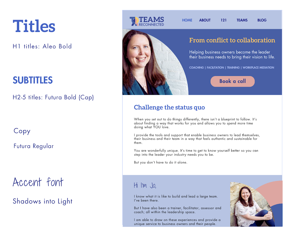
One client I worked with was using different fonts across her social media and website. Her website alone had three similar fonts without any consistency around which was used for headings, subheadings or body copy.
So I simplified it.
We used the same font for headers, subheadings and copy, creating the difference through size, bold and capitals. Then we added one obviously different accent font for things like quotes and testimonials.
I also created a simple crib sheet she could refer to while creating content.
Again, it’s about removing decisions.
You don’t want to sit down to create something and start wondering which of those five fonts you used last time.
Supporting graphics give your brand its own visual language
Supporting assets could be shapes, frames, drawings, icons, illustrations or elements taken from your logo.
And they don’t all have to be designed especially for you.
I use stock icons and Canva graphics for clients all the time. The trick is consistency.
If you find an illustration or icon that works, keep a record of it. Then, when you need something new, don’t just pick the first thing a Canva search throws at you. Spend a few extra minutes finding something that is visually similar to the assets you’ve already used.
You can make a collection of stock assets LOOK as though they were designed especially for your brand.
Without that consistency, grabbing graphics pic’n’mix style can start to water your brand down.
And supporting assets can do a practical job too.
I worked with a client who had developed a six-step strategy for care home managers to support their staff. I created an icon for each step based on sketches she had made herself: a speech bubble for ‘Speak Up’, links for ‘Map Relationships’ and so on.
Each step had its own colour too, so we could colour-code sections throughout the manual.
Those icons became such an important part of her visual language that when she later decided she needed a full rebrand, they were incorporated into the logo itself.

Your photography should look like it belongs to your brand
I think most small businesses need a mixture of their own photography and carefully selected stock images.
If you’re the face of your business, having photos of YOU is pretty vital. People buy from people.
That doesn’t mean you need an expensive professional photoshoot. Most of us can take pretty good photos on our phones now.
But make some intentional choices.
Could you wear your brand colours, or colours that complement them? Should your photography feel bright, pastel or dark? Is there a particular filter or treatment you could use consistently?
Then think the same way when choosing stock imagery. Look for photographs with a similar feel and, where possible, colours that work with your palette.
You don’t need every photograph to look identical. You just want them to feel like they belong to the same brand.
You need versions of your logo for different situations
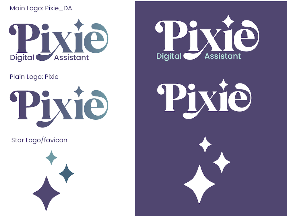
Even the logo itself usually needs to be more than one file.
At the very least, you need a version that works on a dark background.
If your logo is very round or square, you might need a longer version for spaces like document or website headers. If it’s very long, you may need an icon or brand mark that can stand alone when the full logo won’t fit.
These aren’t extra logos for the sake of it. They make sure your identity actually works wherever you need to use it.
Templates help you turn the individual pieces into a brand
Quite often, clients with an existing brand actually start with me here.
They have a brand, but they aren’t quite sure how to use it.
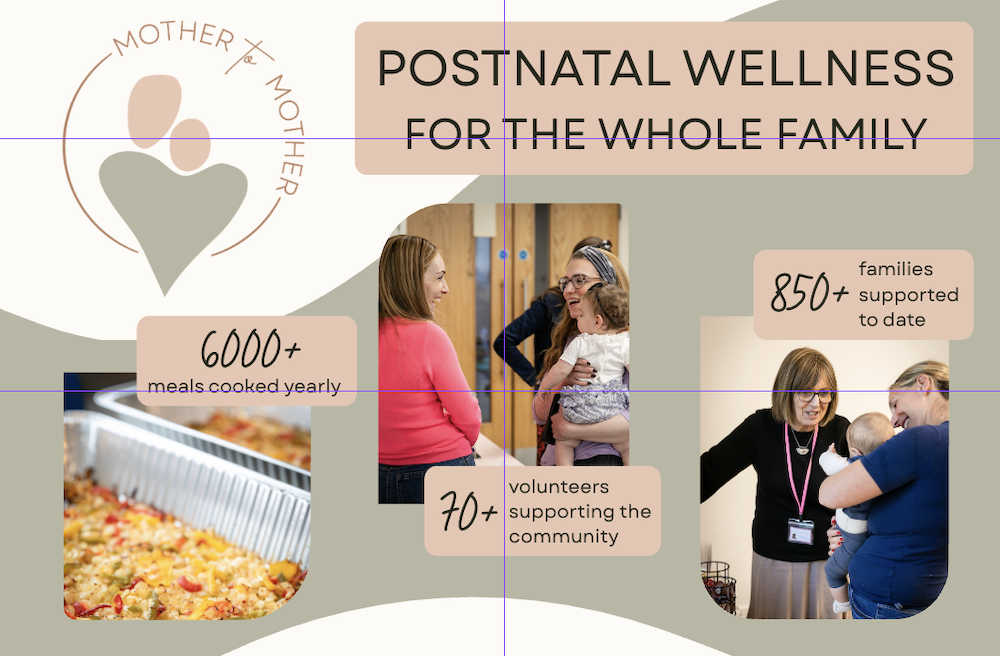
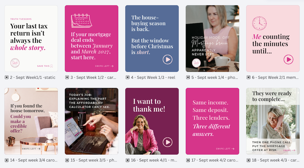
When I create templates for them, I’ll find a visual language that suits the brand they already have and then use it consistently.
That could be a few specific shapes or frames, a particular alignment, the way colours are combined or how photographs are treated.
I recently worked on a project where I created the main brand and then worked alongside a web designer who built the website. I really liked the dark overlay and rounded image frames they introduced.
So when I later created PDF downloads and social media tiles, I deliberately incorporated those elements into my designs.
They had become part of the visual language.
And this is important: your brand doesn’t have to be completely finished on day one.
Brands evolve. Sometimes you discover something later that works brilliantly and decide to incorporate it.
The important bit is the deliberately.
More brand assets can actually give you more freedom
It might sound as though having all these assets and rules would make your brand more restrictive, but in my experience it does the opposite.
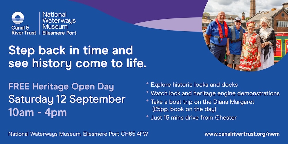
I regularly design for Canal & River Trust, whose brand guidelines are ENORMOUS. Around 200 pages enormous!
They have strict rules around their logo, but also a wide colour palette, a distinctive ripple pattern and a huge library of illustrations.
Of course, I am absolutely NOT suggesting a small business needs a 200-page brand guidelines document.
But working within theirs is surprisingly flexible and fun because there are so many ingredients to choose from while still creating something that is unmistakably part of the same brand.
That’s the point of having a bigger brand toolkit. It gives you more to work with without watering your brand down.
Before you add anything new, audit what you already have
And your problem might not be that you don’t have enough brand assets.
You might have TOO MANY.
Colours creep in. Fonts creep in. You find an illustration for one post, another for the next one and something completely different a week later.
So start with a mini brand audit.
Look back through your website, social media, PDFs and other marketing. Which colours, fonts and assets are you actually using?
If an unofficial addition is working well, deliberately add it to your brand kit. Save the colour code. Keep the graphic. Write down the font.
If you’ve accumulated too many, decide which ones you’re going to stop using.
Then, over time, start collecting the shapes, icons, image treatments and other assets that you use consistently somewhere you can easily find and reuse them.
Ideally, this will eventually become your own digital brand guidelines document, which is exactly what I’m going to talk about in my next post: How do I keep track of all the different details of my brand?
A fully functioning brand makes creating content easier
Ultimately, your customers probably aren’t consciously thinking:
“I see she’s used the same rounded image frame as last Tuesday.”
But those details are cumulative.
Consistency builds recognition and trust. Over time, people can start to recognise your content before they’ve even noticed your logo.
But there’s another benefit that is just as important.
It makes creating content frictionless.
When your colours, fonts, graphics, photography style and templates are already at your fingertips, you don’t have to make dozens of tiny design decisions every time you need to create something.
And that’s what I think is often hiding underneath “I just need a new logo.”
What you really want is a fully functioning brand. One that gives you the tools you need, makes creating content easier and makes you proud of how your business shows up.
Collecting those supporting assets doesn’t need to be complicated, difficult or expensive. But it DOES need to be intentional.
Not sure what your brand is missing?
If you’ve read this and realised your brand has picked up a few extra colours, fonts and random Canva graphics along the way, or you simply don’t have enough to work with, you don’t necessarily need to start again.
Sometimes you just need another pair of eyes to look at what you already have, work out what’s working, what’s missing and what could make your brand easier to use.
That’s exactly the kind of thing we can figure out together in a Branding Lab. In 60 minutes, we can look at where your brand is now and work out what it needs next, without automatically throwing everything out and starting again.